Elton’s Golden Years; Designing for the Yellow Brick Road, with Jacqui Pyle
How did you get into sculpture for the entertainment industry?
In the early 90’s after working in a provincial theatre I was looking for work as a scenic artist.
I walked into a studio close to where I lived hoping to find work.
I was told the opportunities were in sculpture. So I quickly modified my C.V to say I was not only a scenic painter but a sculptor too!
Fortunately for me, my family background included quite a few stone carvers and thankfully I appeared to have inherited the understanding of 3-dimensional form. This was lucky, it became my passion, my working days slipped by, hours felt like minutes. It was totally absorbing. There was never enough time.
I often think of my younger self and the courage (and cheek) I had to tell a white lie which eventually came true. I became a sculptor!
Back then the opportunities were very exciting, musical theatre was extremely popular and the designs were lavish and detailed. I had the chance to create sculptures for Maria Björnson, Richard Hudson, Mark Thompson to name a few, and their attention to detail allowed me to develop my skills. Maria Björnson was uncompromising in her expectations, and you had to get it right!
When did you first work with STUFISH?
‘I first met Mark when he came to the Stephen Pyle workshop, after being introduced by Brilliant Stages.
He had wanted to create design elements that looked like curved metal but where actually fiberglass panels. The workshop was well experienced creating set pieces for Elton John and AC/DC and Ralph Koltai with impressive metal finishes.
During this visit I was working on an experimental model for Johan Engels the theatre designer and Mark was interested in the processes of sculpting, mould making and casting.
My first projects with STUFISH were during my time working at Stephen Pyle Workshop on the We Will Rock you musical and Nelson Mandela concert in Cape Town.
My first independent project with STUFISH, was the Wynn Macau Iris.
What was the process of the design?
The Wynn Macau Iris project was a real departure from previous opportunities because it gave me the chance to take one decorative aspect of the design from concept sketch to an enlarged sculpture used during the show.
This approach was also used for Farewell Yellow Brick Road. My most recent collaboration with STUFISH :
The design stages were:
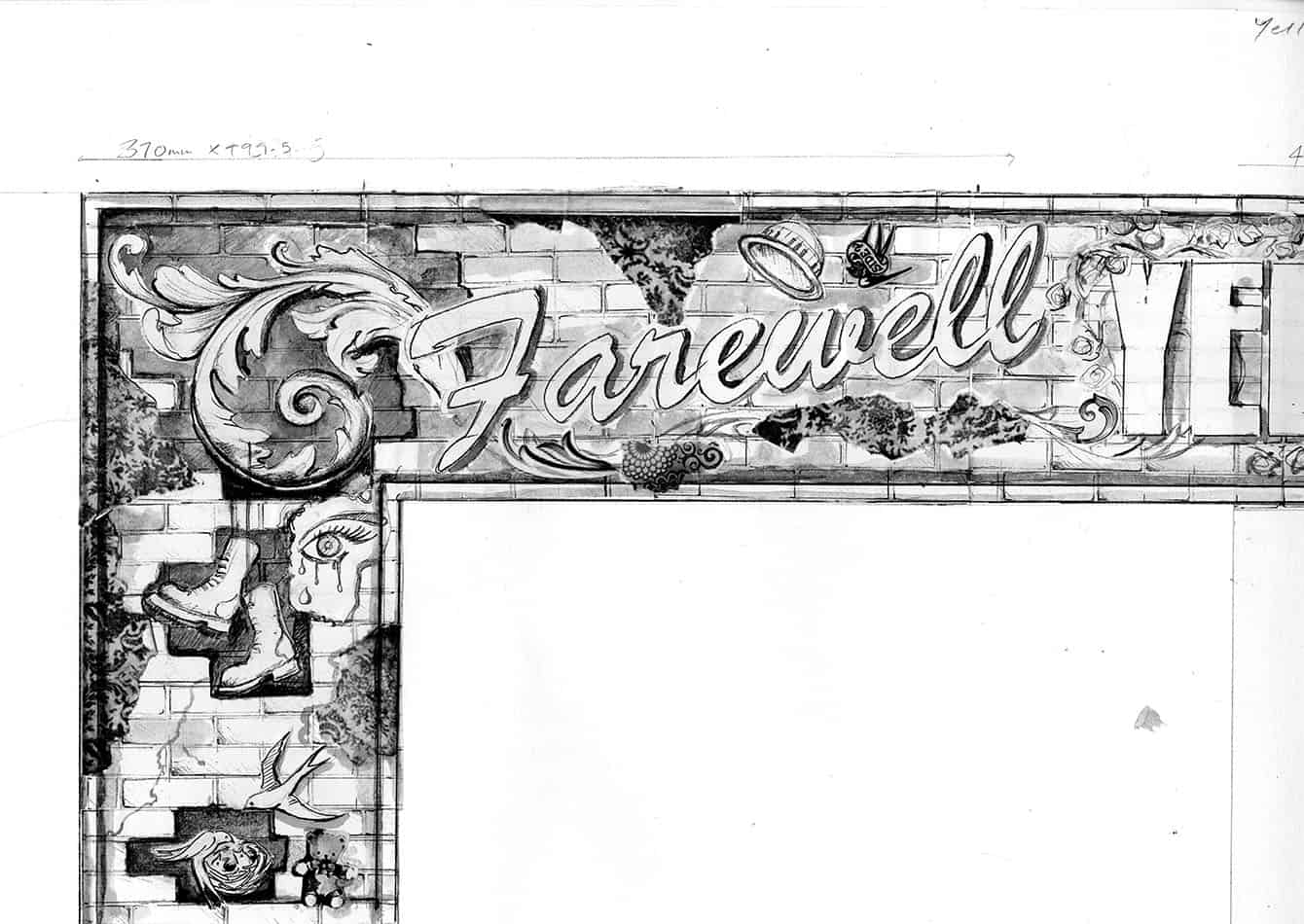
- Artistic sketching
- Detail drawings for approval.
- Scale models (maquettes)
- Supervising the enlargement
STUFISH’s set design was a golden brick portal surrounding a vast LED screen and stage. Ray Winkler from STUFISH asked me to consider the decorative embellishment for the golden brick surround.
Instantly I felt it should be a homage to Elton’s world, maybe from a fans point of view. I thought about objects from Elton’s history and which ones would evoke memories of his music, his shows and personal journey and consequently our own.
As the audience entered the arena before the show began, they would consider the meaning of the decoration and placed objects within the golden (yellow brick road) frame.
After various options were presented to Rocket (Elton John’s management), the idea was chosen for the portal decoration:
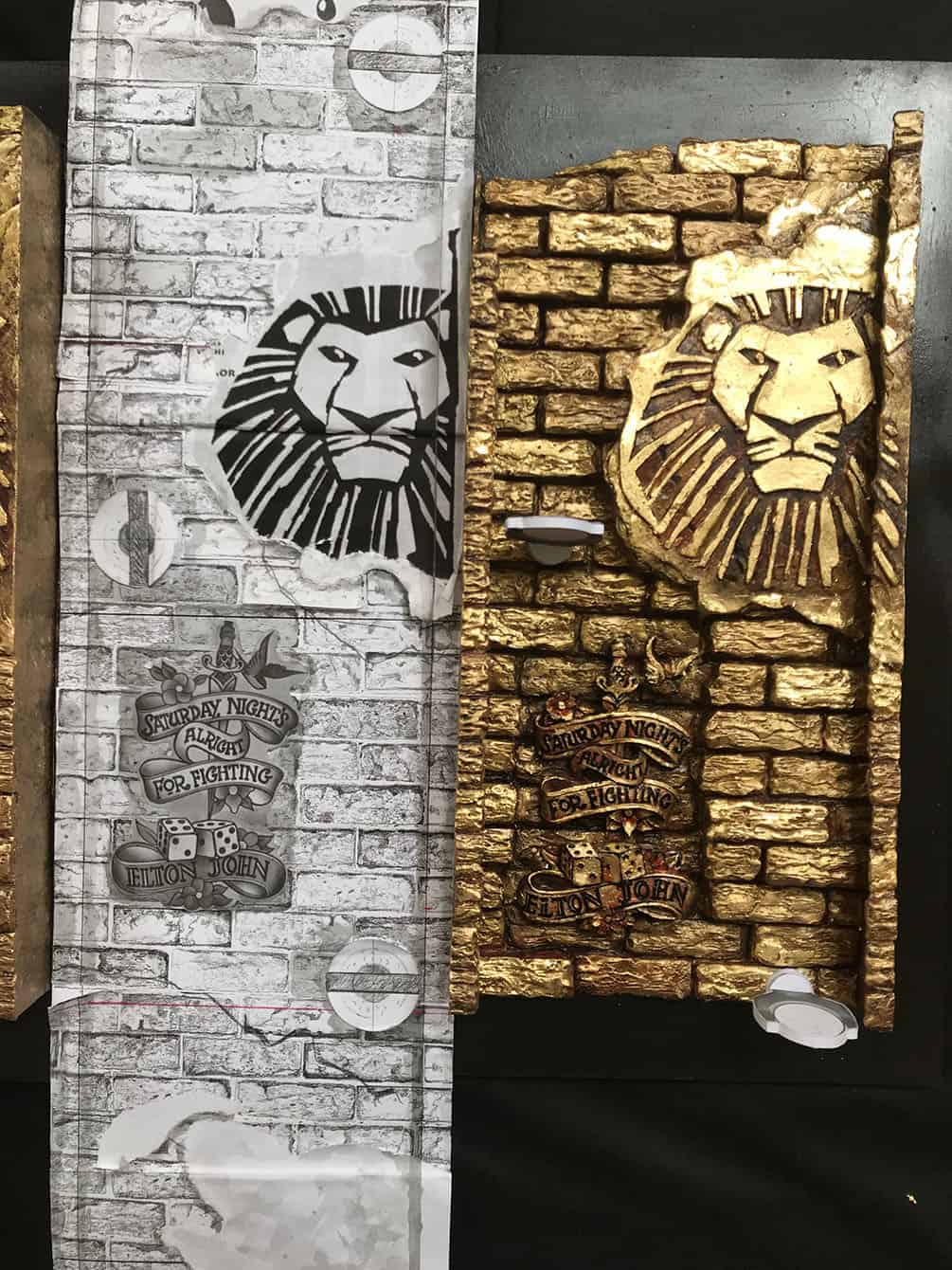
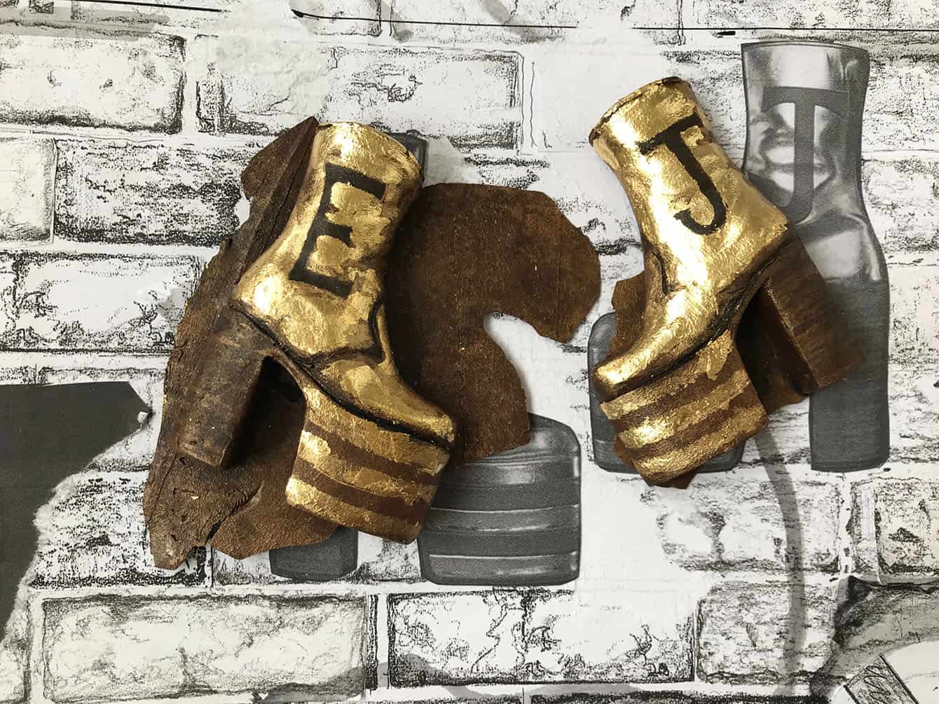
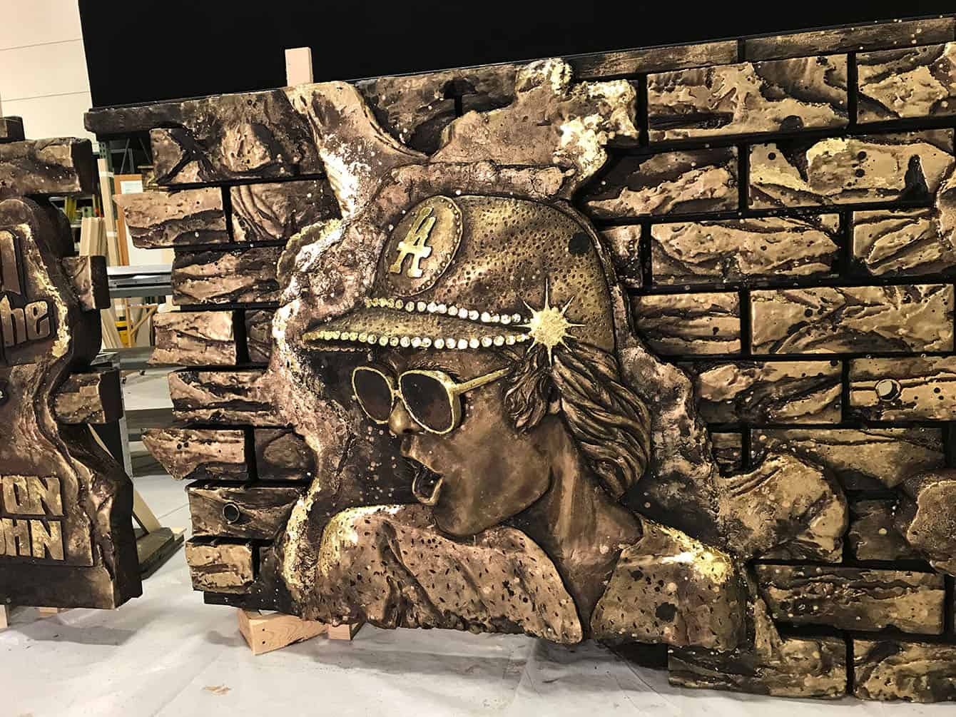
This brick frame is like the Goodbye Yellow Brick Road Portal on the album cover. However, this brick work has varying textures and levels with areas of plaster displaying iconic posters and artwork that are embossed and sculpted.
There was going to be film content that explored and interpreted many of Elton’s songs, so the Frame would illustrate other aspects of his life, recalling friendships, theatrical shows, album covers and artworks. Rocket provided a list of all the artworks they wanted included and all I had to do was fit them in!
THIS BRICK FRAME IS LIKE THE GOODBYE YELLOW BRICK ROAD PORTAL ON THE ALBUM COVER. HOWEVER, THIS BRICK WORK HAS VARYING TEXTURES AND LEVELS WITH AREAS OF PLASTER DISPLAYING ICONIC POSTERS AND ARTWORK THAT ARE EMBOSSED AND SCULPTED. THE BRICK WORK WILL CONTINUE DOWN ONTO THE EDGES OF THE STAGE. THE FRONT OF THE STAGE BRICK WALL CONTINUES THE THEME WITH ARTWORK, PLASTER AND BRICKWORK.
What were the challenges?
To do this I needed to create a definitive drawing with the artworks. This drawing would also illustrate the lighting positions determined by Patrick Woodroffe. I needed to consider the brickwork and artwork’s height so they did not block the route of the light, whilst at the same time they couldn’t create obvious pathway patterns either of high or low bricks.
It was a fantastic puzzle that could only be resolved by creating a scale model, which would be the next stage.
A 1:6 model was produced including the brick architrave showing a few of the artworks. The general feel of the piece was approved meaning I could move forward to create the whole frame portal at a 1:6 scale.
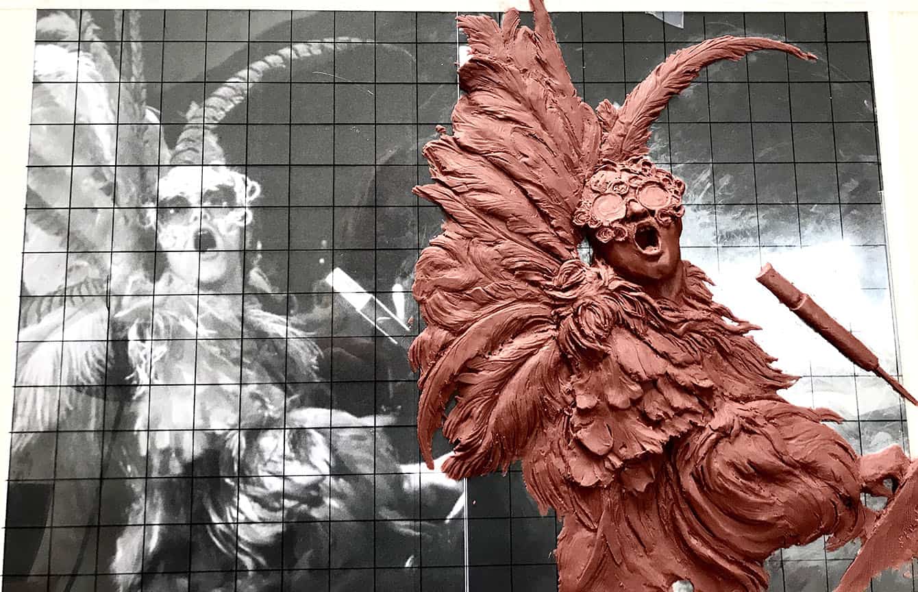
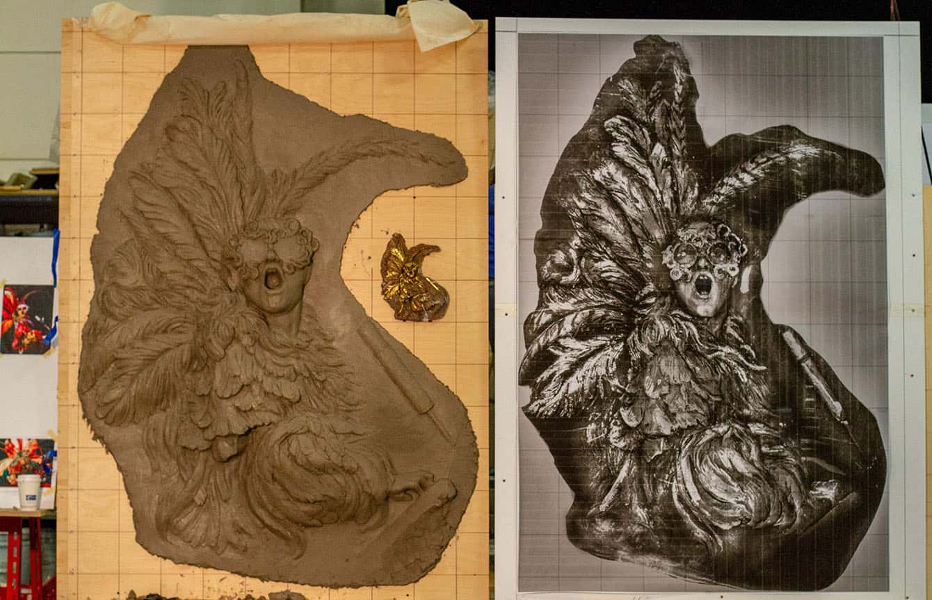
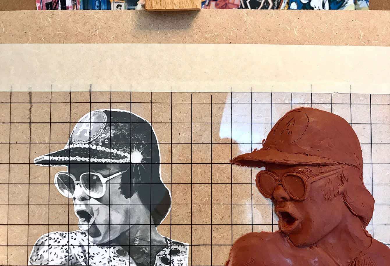
To start with I took all the individual artworks and produced them to scale. I would take photographs as I progressed and send them to STUFISH and Rocket for approval.
After approval molds where created for each artwork and casts where taken. These were then painted for a second approval.
What did you learn from this project and what is your most fun moment of the project?
Each Artwork had its own journey, particularly the portraits. Sometimes the image supplied was not enough, so I’d source other pictures, often reading the articles of incidences and happenings, sometimes funny other times sad but always fascinating.
Once the artworks were completed there was the fun job of producing tiny bricks, all at different levels. I sculpted different depths and textures and set about casting hundreds of them from molds.
You can be assured no matter how hard try, you always underestimate how many to produce, too many of one height, and not enough of another. To this day I have boxes of little bricks tucked away in my studio!
Once the bricks and artworks were positioned, taking into account the lighting and break lines for touring, (never through an artwork), another mold was produced, and final casts were created.
Finally, it was done. The scale artwork could travel to the contractor Tait’s who would produce the finished enlargement for the show.
During this period, I was in conversation with the artists, and travelled to the workshops as the artworks progressed to provide guidance to the artistic finish.
Immense care was taken to follow the design faithfully and I was grateful to the very calm and conscientious Karla Ramsey of Tait’s who lead the team of artists, also Shannon Harvey the project manager who kept it all moving along. The enlargement really was a refined version of the maquette finished with lots of love and passion for the project.
Farewell Yellow Brick Road was an exciting opportunity and a true high for Elton John’s finale tour. It was a massive team effort that I was very proud to be part of.
